
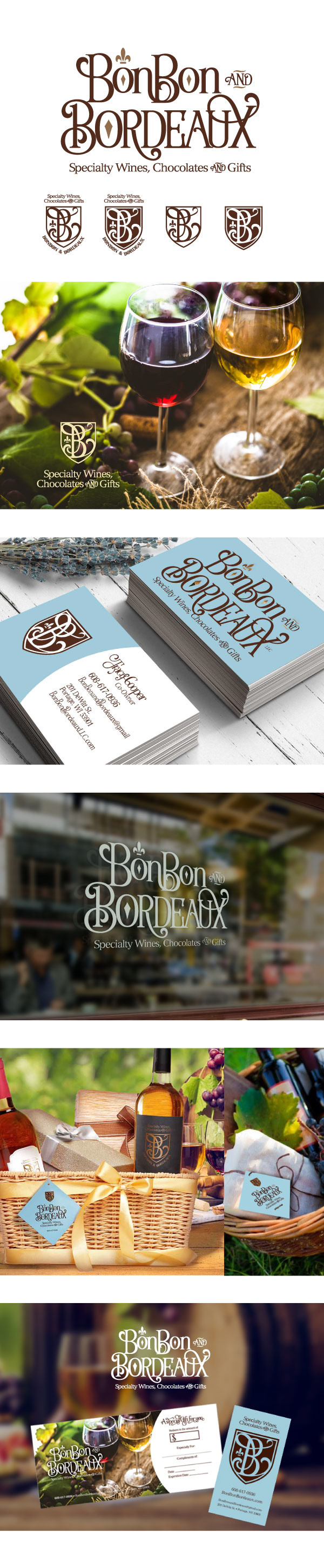
BonBon and Bordeaux is an elite boutique that is in Portage WI. They offer a wide variety of wines, luscious chocolates and exclusive kitchen/wine accessories. They pride themselves in helping you find “your” wine. They wanted their logo to have a French Country feel with a touch of elegance but also evoke a friendly, welcoming atmosphere. Their target market is 30-80 - a person who likes the finer things in life, enjoys splurging, loves to give and own unique items, enjoys art, wine and learning. The logo establishes a chic and elegance that represents the owners as well as the products they offer. Using a combination of typeface I was able to manipulate the fonts into a sophisticated carefree feel. The swirls support and add a natural, organic and artistic feel. The diamonds and Fleur-de-lis shape bring in a touch of royalty. I used metallic bronze ink for depth, elegance and a touch of surprise - you do not see the bronze until the light hits it just right. The browns and blues give a solid earthy feel, which balances and calms. The "B" monogram complements the logo, used as a crest that helps to create a brand family look. The monogram complements the main logo and is used for tags, labels and shopping bags to support the brand look and feel. The combination is unique and memorable among the competition. As requested it is welcoming but has a level of simple elegance.