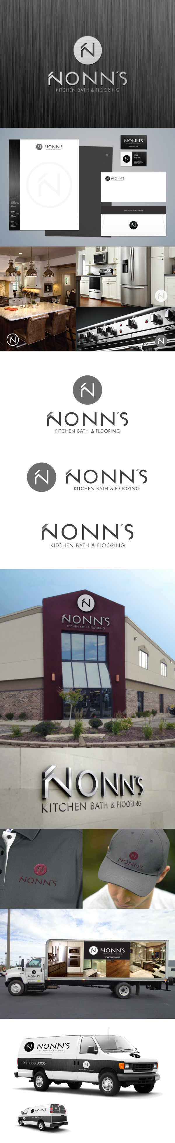
As Nonn’s approached its 30th anniversary, It was clear the time had come to rethink the company’s identity. After extensive market research and brand analysis, POP-DOT hired me to create the logo.
I used the market research provided to explore many possibilities, and In the end this logo was the winner.
I approached it like a fine art piece, using the positive and negative space to shape the "N" and implementing a subtle color variance that brought the logo to life, resulting in an identity mark that enhanced the Agency's vision for the client.